Complex products, made obvious.
Senior Product Designer. Six years in health, AI and fintech, end to end.
What the work below has done.
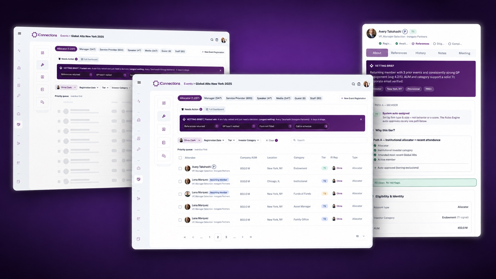 Internal tool · Private investor network
Rethinking a legacy workflow with Claude Code
Hoursfrom zero to a prototype the team could actually use
Open case +Close case −
Rethinking a legacy workflow with Claude Code
Problem
The vetting flow had grown around operational needs collected over years: manual steps, information scattered across people and places, and no reliable view of where any registration stood.
Solution
We questioned the structure instead of patching the screens — and I built the new flow as a working prototype, so its logic could be tested by the people who would live with it before engineering committed to any of it.
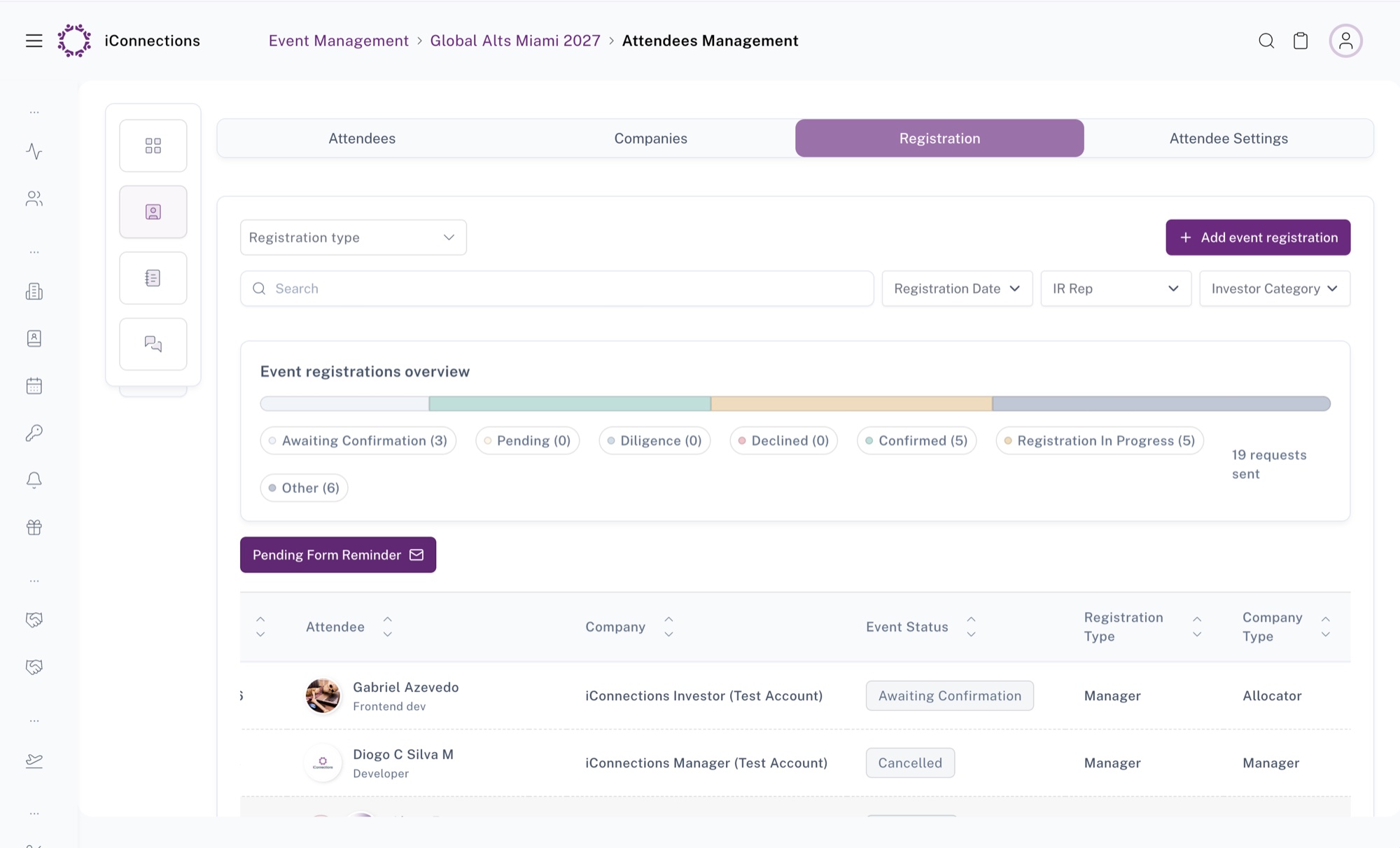
Seven statuses and a count beside each. It reported the state of the world, and left you to work out what to do about it.
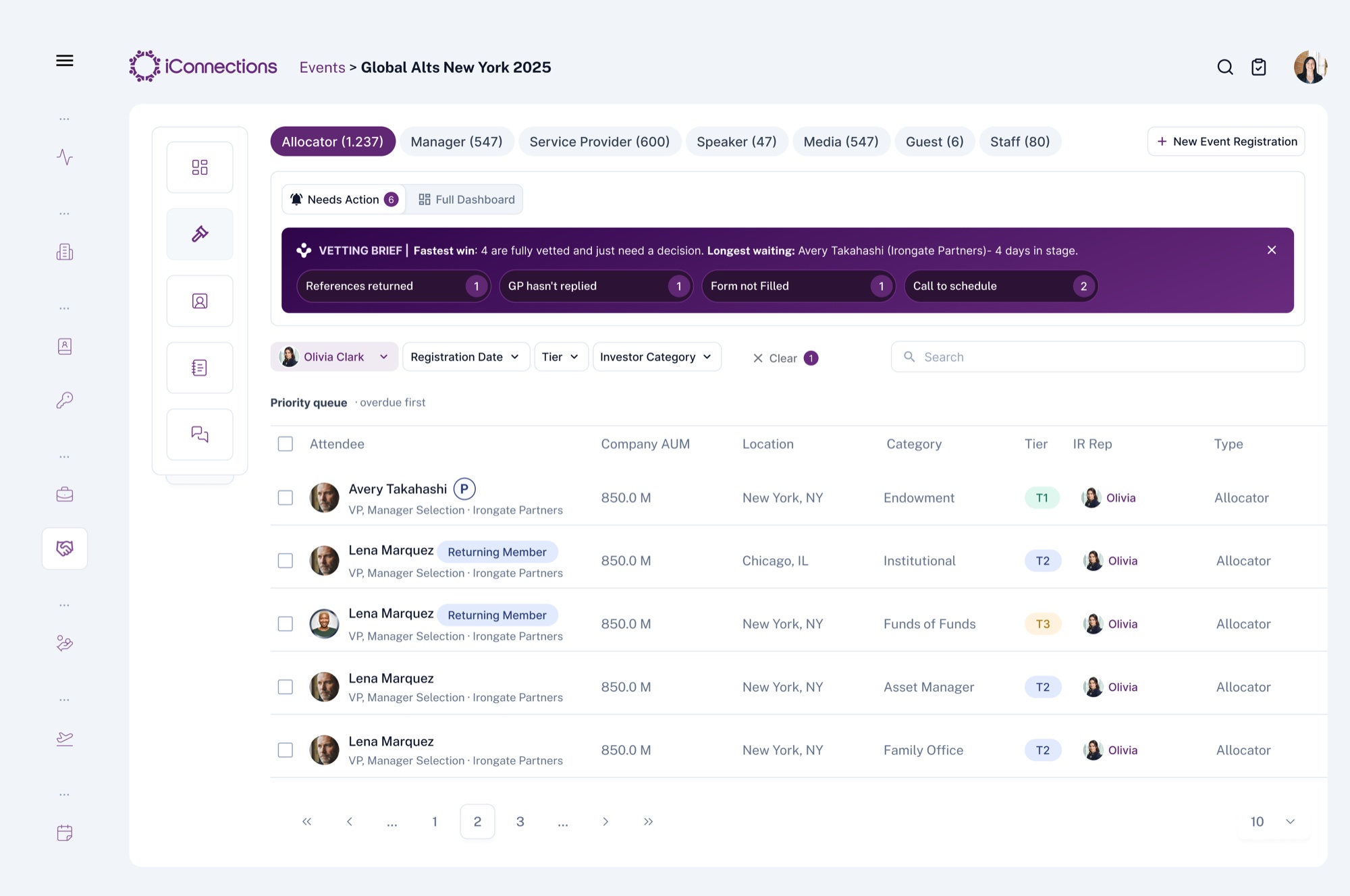
A queue ordered overdue-first, under a brief that names the next action: which registrations are past SLA, and which are one decision away from done.
The problem
A workflow nobody had designed.
Vetting decides who gets into the room — who this person is, which firm they represent, how much capital they manage. It was running on manual steps, scattered records and people asking each other where things stood: a structure built by accumulation, not by decision. Improving the screens would have made the symptoms prettier and left the shape intact.
Why not Figma
What needed validating was not a sequence of screens.
A Figma prototype demonstrates a happy path. This was several kinds of user with different permissions, incomplete information arriving at unpredictable times, status changing as a consequence of other events, responsibilities crossing teams, and business rules underneath all of it.
Clicking through static frames, everyone nods. The disagreements only surface when someone tries to do their actual job and hits a state the frames never showed.
What I did
Built it in code with Claude Code, against our real components.
Our component library was already set up in the project, so what came out used real components, real states and real behaviour — feedback was about the product, not about the fidelity of a mock. And what engineering received was a pull request with the flow, the documented rules behind it and notes on where AI had done the work: something to read and argue with, not a file to interpret.
It took a few hours to have something navigable. The same thing in Figma would have taken days — and would still not have behaved like the product.
What changed
Validation moved into the build.
Nobody read a diagram. People opened it and tried to get their work done — which is a completely different kind of feedback. We tested hypotheses before spending engineering time on them, found edge cases while changing them was still cheap, and argued about business rules through concrete behaviour instead of description.
It also forces honesty: a working prototype cannot hide an unresolved decision. If a state is undefined, it shows.
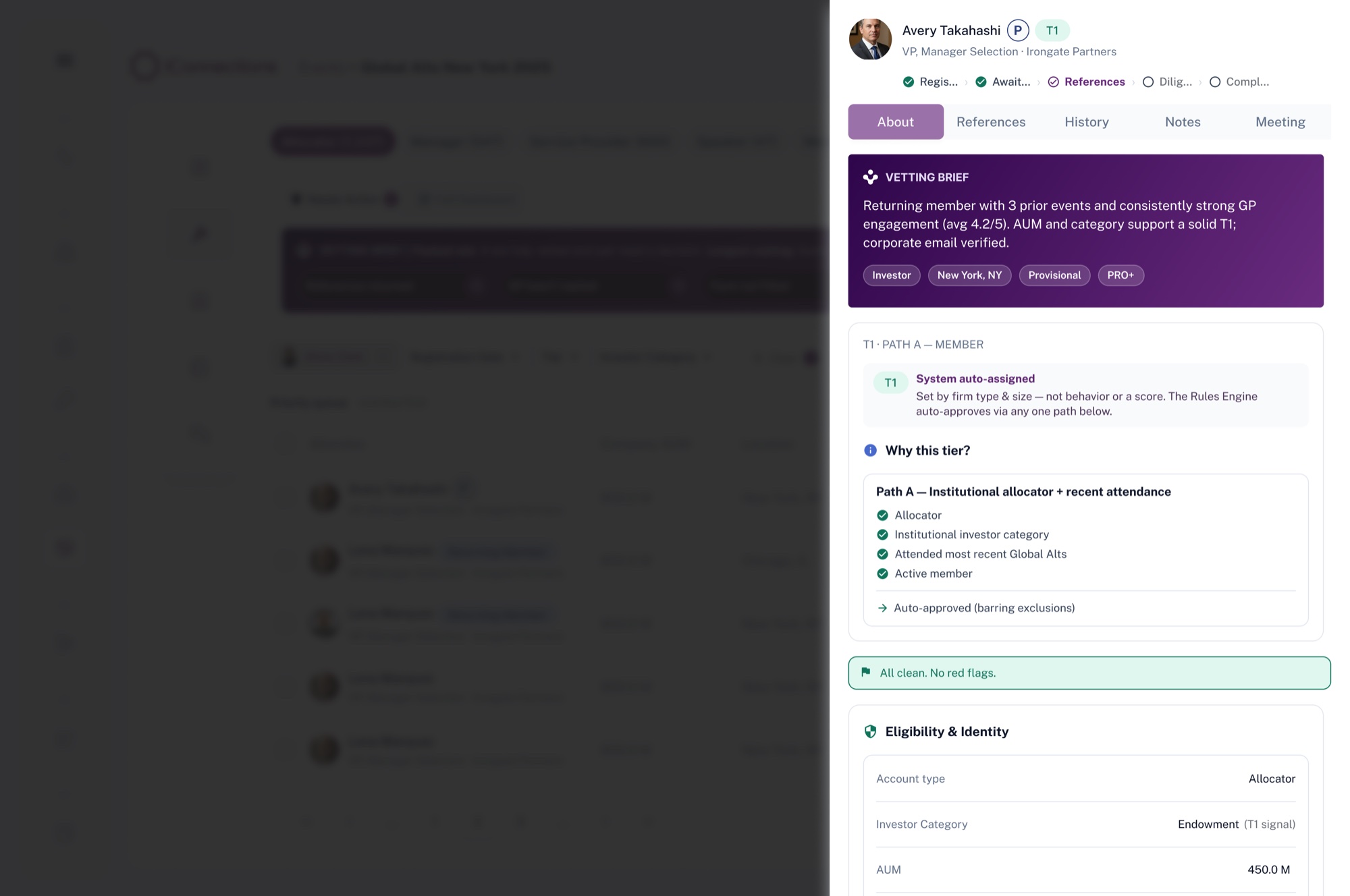
One rule that came out of it — when the system decides something on its own, it shows the signals it decided from. An automatic tier nobody can question is not a decision anyone can take responsibility for.
The part that was mine
Claude Code accelerated the construction. It did not decide what to build.
The work was investigating how vetting actually ran, separating legitimate needs from inherited limitations, and turning operational rules into product logic — then directing what the tool produced and reviewing it critically, because a prototype that behaves plausibly but wrongly is worse than no prototype.
 Mobile · Private investor network
News Feed
5.8%click-through on feed actions — above the 2–5% benchmark
Rewards every open. Routes attention onward.
Open case +Close case −
News Feed
Problem
The app only mattered around events. Between them, members opened it, found nothing new, and left.
Solution
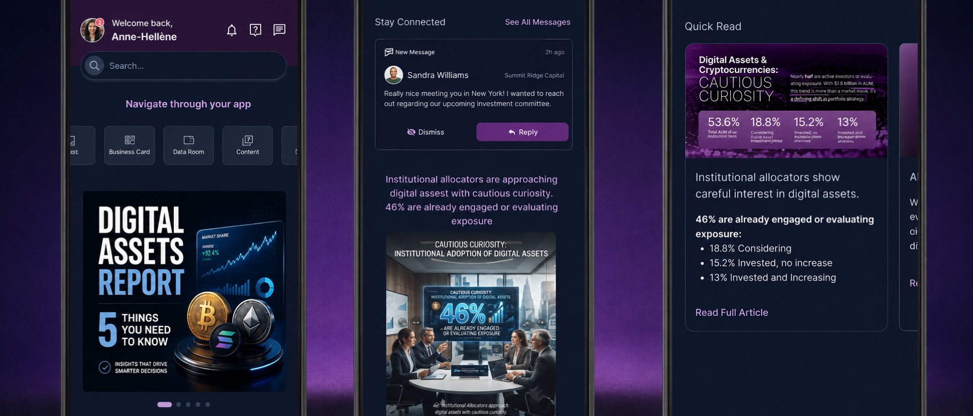
A feed that gives something back on every open — and routes attention into the rest of the product.
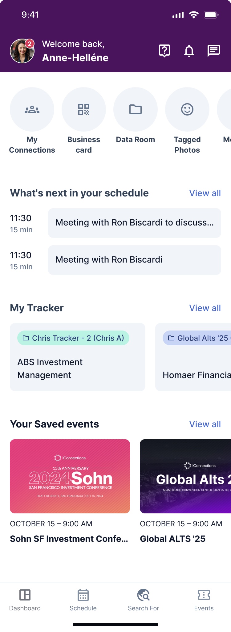
Fixed sections and horizontal carousels. Everything competed; half the content sat off-screen.
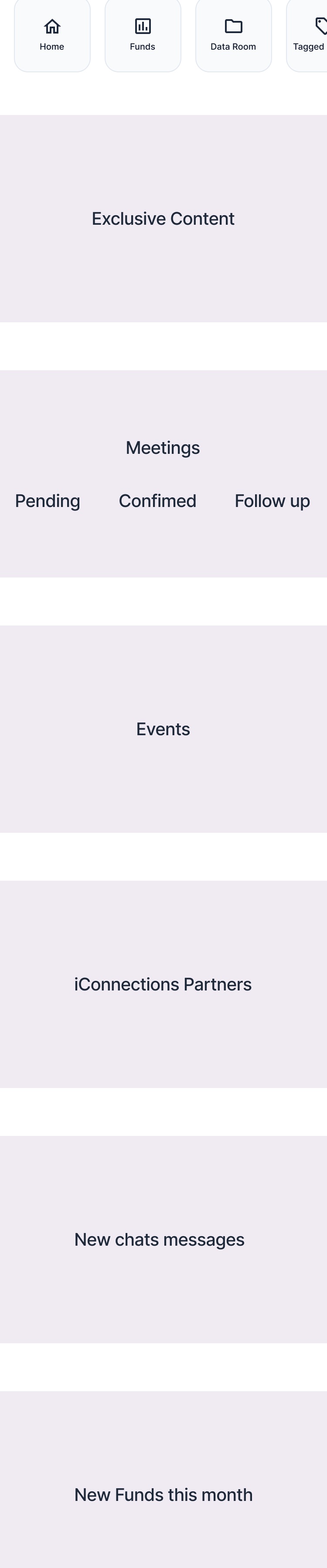
Behavioral principles set the order: immediate reward first, social-network noise never.
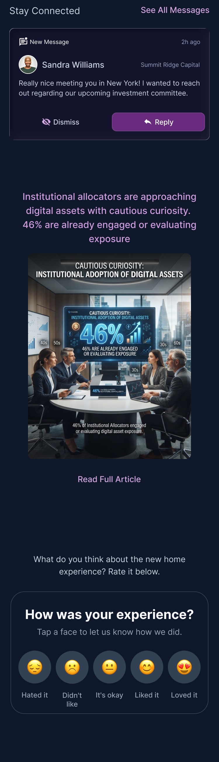
One system of card types: message, invite, article, feedback, sponsor.
The constraint
One month, first idea to live, with one designer.
Six people: a PM, a data analyst, the content team, two engineers, and me as the only designer. No room for a long discovery phase, and no solution that needed a new backend.
Where we started
Every section had equal weight, and carousels hid the rest.
Schedule, tracker, saved events — fixed slots, none more important than another, each hiding most of its content off-screen.
Decision 01
We ordered the modules before drawing a single pixel.

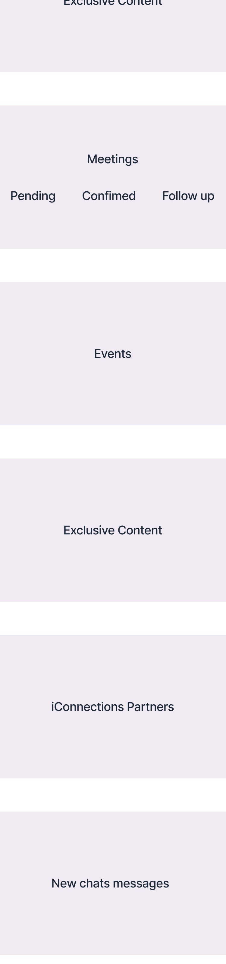

Three passes at what earns a slot and in what order. Fixed sections became a priority-ordered stream.
Decision 02
Six behavioral principles set the order.
- 01Cognitive clarity — less friction, more action.
- 02Immediate reward — the screen gives before it asks.
- 03Exclusivity — the feeling of privileged access.
- 04Efficiency — time saved is perceived value.
- 05Discreet authority — status without social-media noise.
- 06Visual consistency — dashboards and content, one language.
Relevance from LinkedIn, density from Bloomberg and PitchBook, habit logic from Duolingo — minus the public counts and vanity metrics.
Decision 03
One system of card types, not a list of posts.
Message, invite, article, feedback, sponsor. Each type carries its own actions, so the feed can reorder itself without redesigning anything.
Both themes
The hierarchy had to survive light and dark.
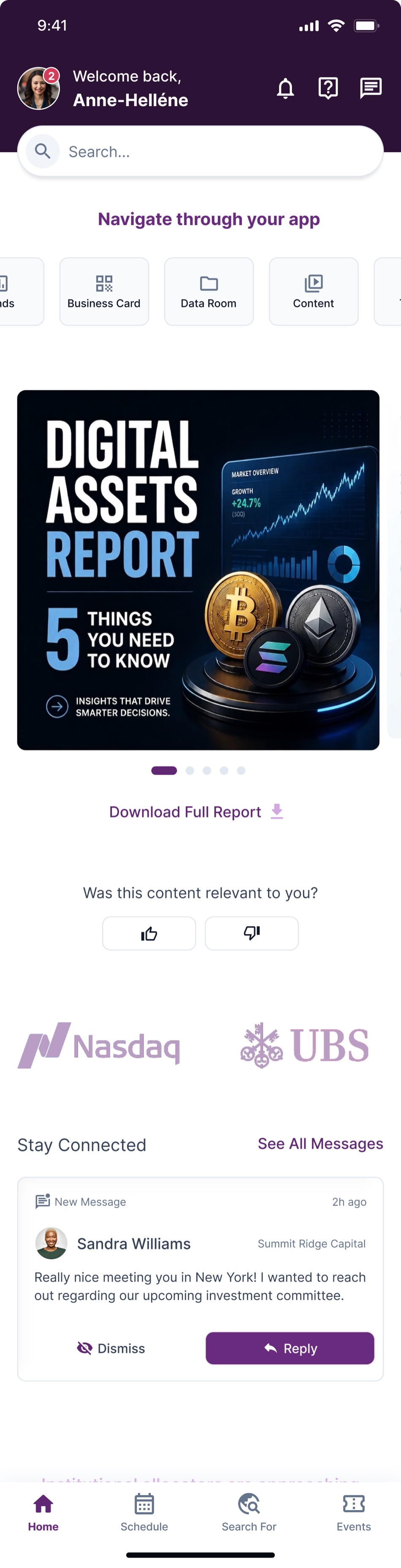
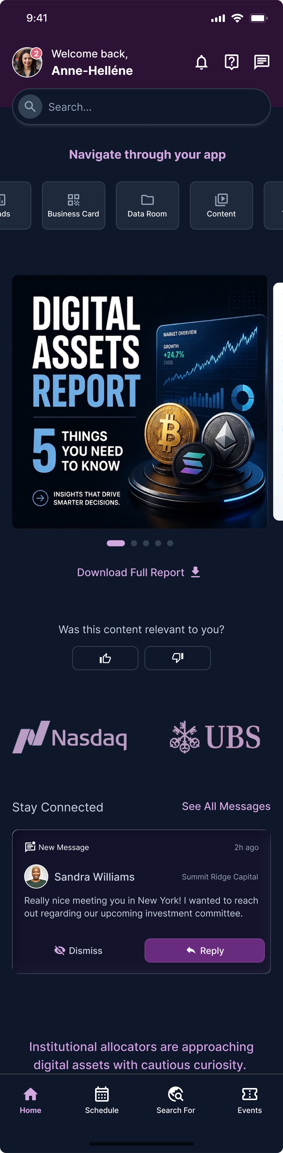
The app ships in both. Priority is carried by position and card type rather than by colour, so the order reads the same either way.
What didn't work
Reading is a shallow form of engagement.
The feed gave members plenty to read and almost nothing to do. That plateau is the foundation of v2: polls, surveys and light games — turning a reader into a participant.
Result
Attention moving outward, which was the point.
A month after launch, measured against the benchmark the team uses — ~2–5% by impression and tile:
- ~5% engagement rate — at the top of the benchmark range. People were reaching the content, not scrolling past it.
- ~5.8% click-through on calls to action — above the range. This is the one that mattered: it measures leaving the feed for something else in the product, which was the point of building it.
Worth being precise about what that does and does not prove. It says the feed earns its place on the home screen and sends people onward. It does not yet say members come back more often, which is the question v2 has to answer.
 Systems · Private investor network
Global Navigation
+40%product discovery
Task-first, role-aware, fewer detours.
Open case +Close case −
Global Navigation
Problem
Navigation had grown with the product, not with its users — duplicated entries, three names for the same list, long paths to core tasks.
Solution
An architecture built on how the platform is actually used: discover, connect, chat — adapted to each role.
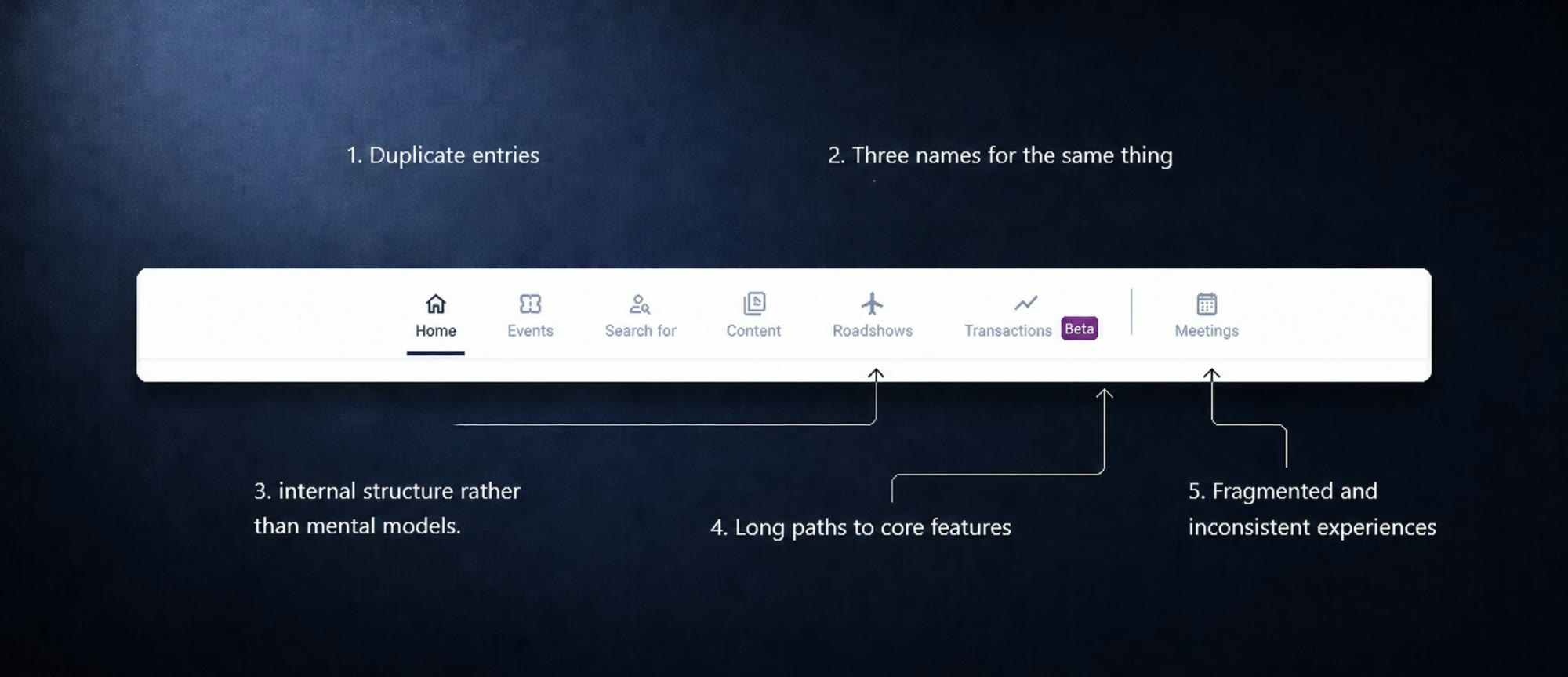
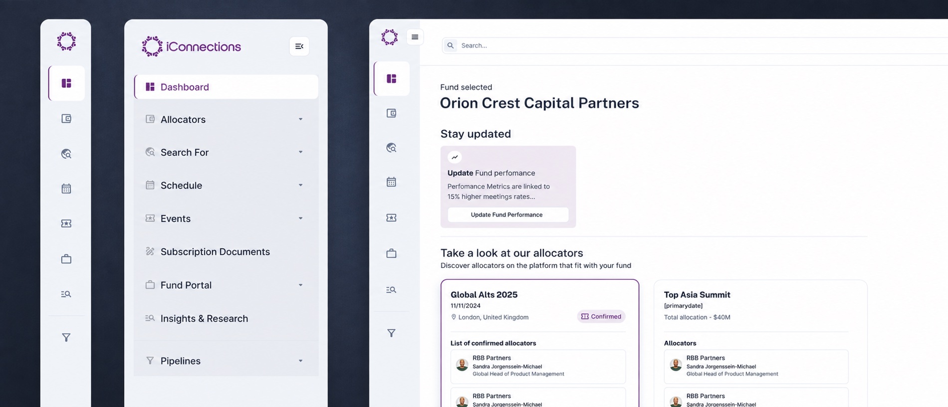
One horizontal bar, seven items, no grouping — and the labels described the product's insides.
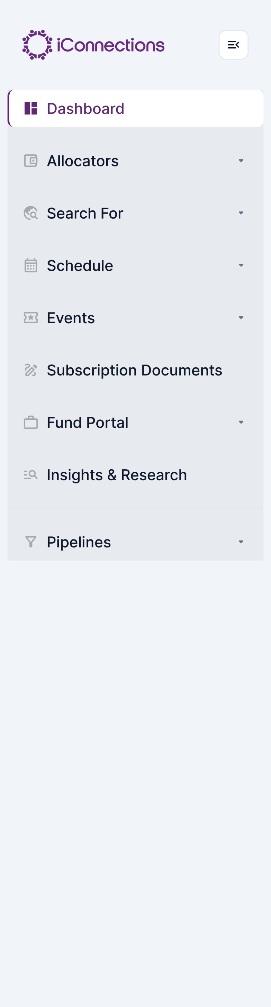
A vertical rail, grouped by task instead of by internal structure.
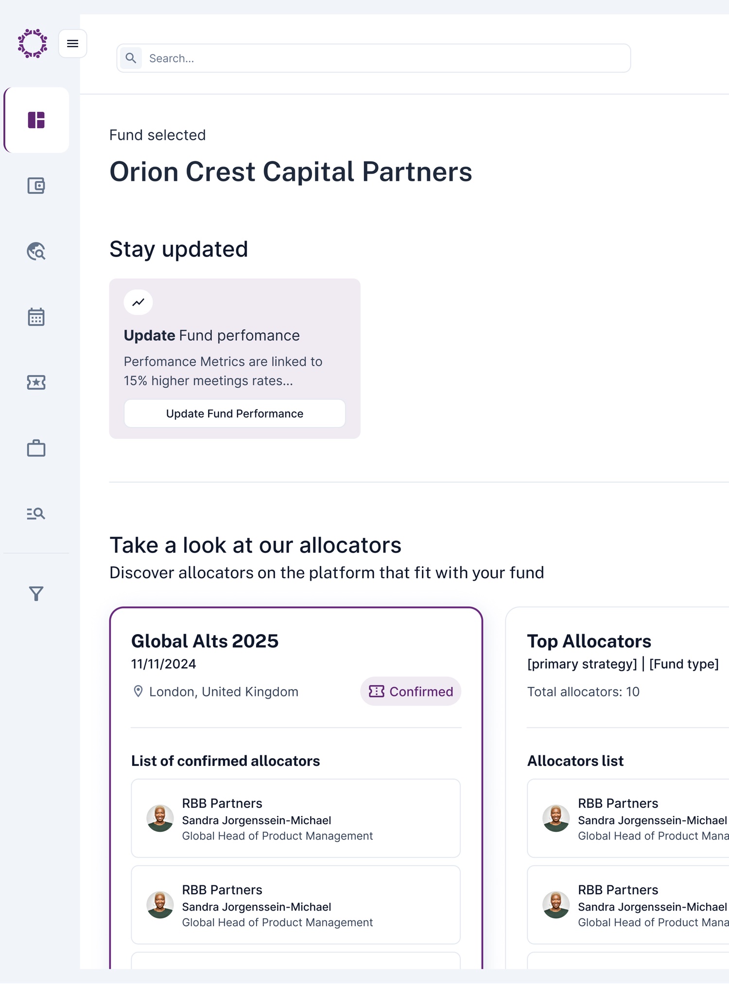
Shorter paths to Funds, Meetings and Chat, whatever your role.
Context
Two audiences, one menu, and neither was served well.
The platform connects allocators (LPs) and fund managers (GPs). Their goals differ, their workflows differ — but the navigation treated them as one undifferentiated user, and had accumulated entries as features shipped.
What was wrong
The menu described the product's insides, not the user's intent.
- Duplicate entries — several different ways into Meetings.
- Three names for the same thing: Lists, My Lists, Watch List.
- Categories mirroring internal structure rather than mental models.
- Long paths to Funds, Managers, Messages, Meetings and Activity.
- Fragmented, inconsistent experiences between LPs and GPs.
The goal
Not a better menu — a faster path through the core workflows.
Reduce cognitive load, increase confidence while navigating, and stay scalable as features keep arriving. The business goal behind it: become the place managers think of first when looking for allocators.
Decision 01
Organise around the cycle: Discover → Connect → Chat.
The navigation should mirror how the platform is actually used — find a fund, manager or allocator; evaluate and connect; start or continue a conversation; move on to meetings and the relationship. Structure follows the loop, not the org chart.
Decision 02
Two states, because focus and orientation are different needs.

An icon rail for people who already know where they're going, and an expanded state for people who don't. The horizontal bar could offer neither.
Research
Eight steps, because renaming things is easy to get wrong.
- Audit of the existing navigation.
- Hypotheses for architecture and naming.
- Tree testing.
- Internal validation with Customer Success.
- Unmoderated testing, then moderated sessions.
- A/B testing recommended for the rollout.
Each session opened with a recall exercise — which sections do you use, what confuses you, how do you normally find this — so participants judged the new structure against their real habits rather than against a blank slate.
What the tests measured
Not preference. Findability, speed and confidence.
- Whether labels matched the user's mental model.
- Whether the grouping felt logical, and the hierarchy readable.
- Time to complete core tasks, and confidence while doing it.
- Cognitive load, measured against the previous navigation.
Result
A 40% increase in product discovery and exploration.
Fewer duplicated entries, consistent naming, and shorter routes to the three things people came for. The structure also holds room for features that did not exist yet — which was the point.
 Health · Training platform
Making training methods executable
−70%fewer athletes asking their coach how to execute a method
The card answers the question.
Open case +Close case −
Making training methods executable
Problem
Trainers write the workout. Athletes execute it alone in the gym — and a method like "drop set" means nothing to someone who has never done one.
Solution
The card teaches the method while you do it: each step in sequence, colour to flag a special method, and a rest timer that stopped taking over the screen.
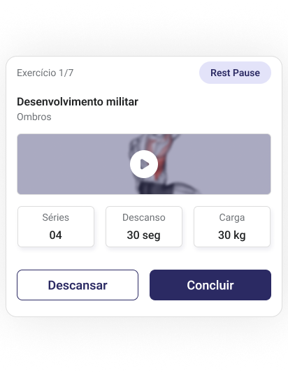
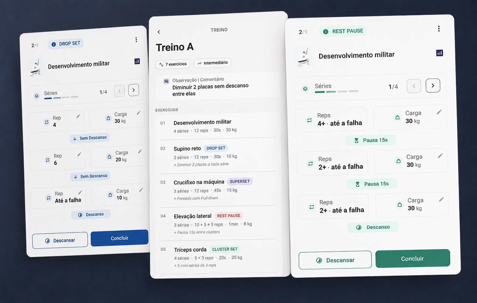
Four series, thirty seconds, thirty kilos. Nothing here says what a rest pause is.
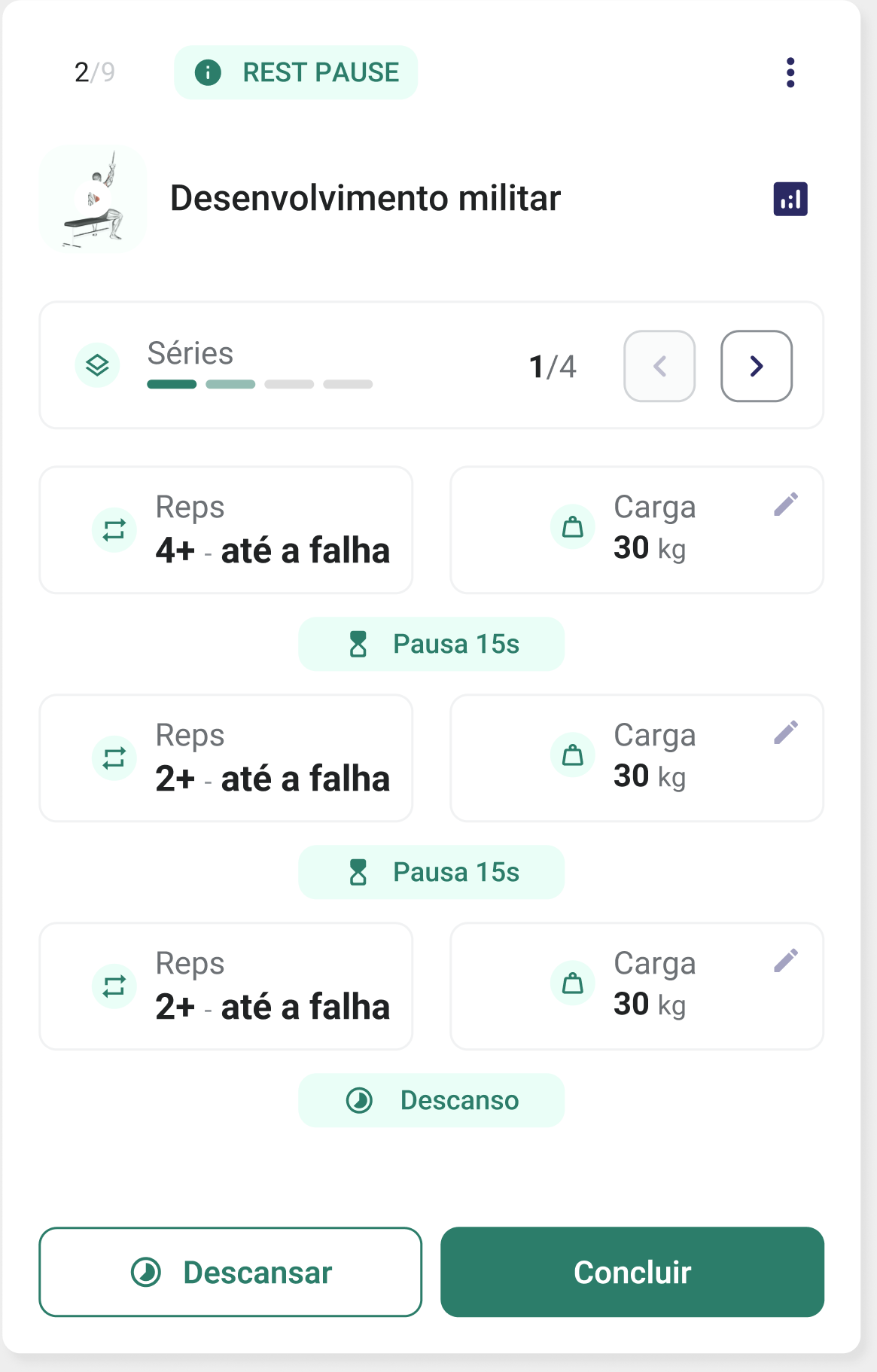
The same method as a sequence: reps to failure, a 15-second pause, again.
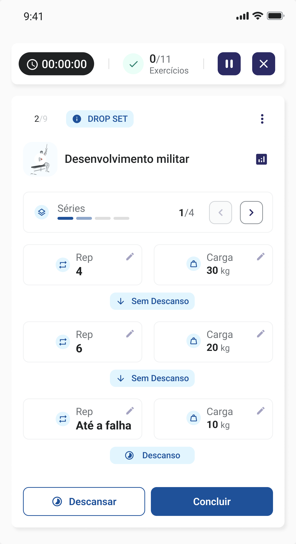
Colour carries the method. Green is a rest pause, blue a drop set.
Context
The person who writes the workout is never there when it is done.
A coach builds the session in advance. The athlete opens it hours or days later, alone, standing at a machine with the phone in one hand. Every question that comes up at that moment has to be answered by the screen, because there is nobody to ask.
The product ships in Portuguese — the screens below are in the language its users actually read. Key terms are translated where they matter.
Problem 01
Five methods, and the card treated every one of them as a label.
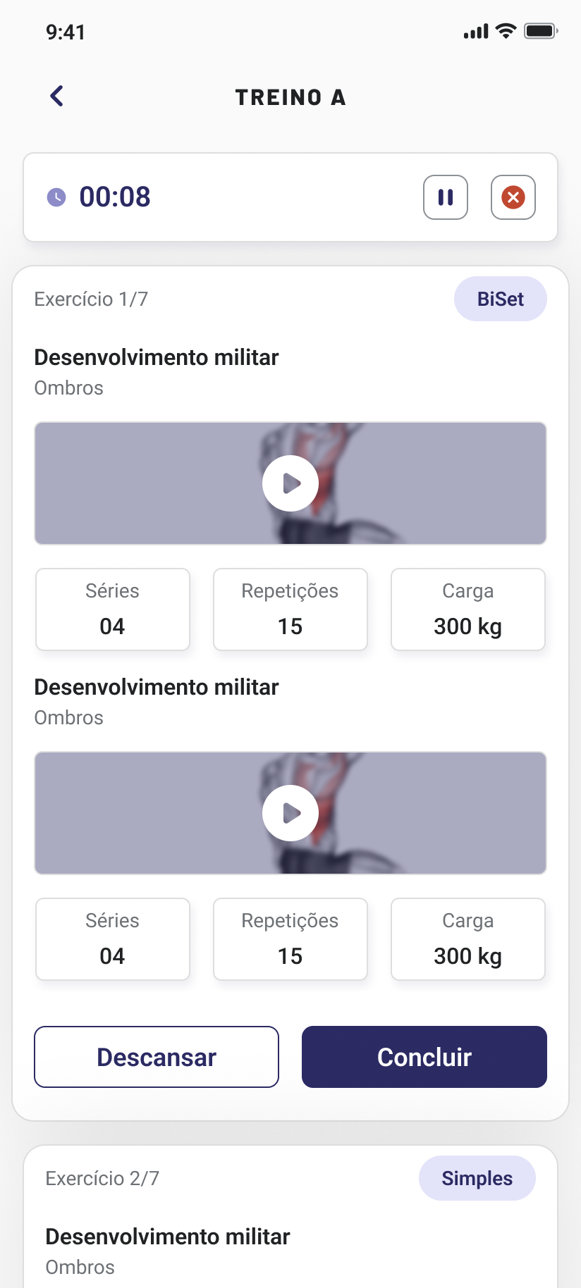
Simple, drop set, super set, rest pause, cluster set — five ways to structure a set, and the card treated all of them the same way: a badge carrying a name.
Here a badge said "BiSet" and two exercises sat stacked below it. Nothing said they belong to the same set, or that you do the second one immediately after the first. The label named the method to someone who already knew it, and told everyone else nothing.
The old rest pause card was the same shape: series, rest, load. Three numbers, and no trace of the thing that actually defines a rest pause — the short pauses inside the set.
Problem 02
Resting looked identical to being stuck.
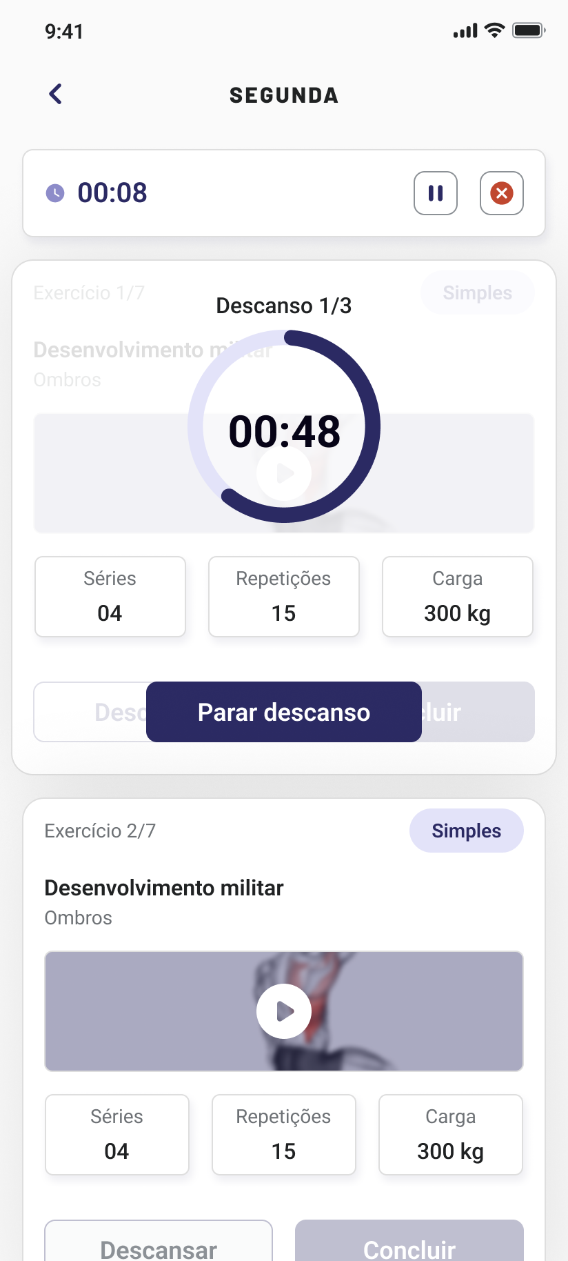
When rest started, the timer took the middle of the card and everything behind it dimmed — exercise name, video, both buttons. There was no visual difference between "you are resting" and "the app has frozen", and people read it as the second one.
How I worked
The rules came from the technical team, not from me.
I went through each method with the platform's training specialists: what defines it, what the athlete must do between one series and the next, where the pause goes and how long it lasts. Design decisions only started once the rules were unambiguous, because a card that explains a method wrongly is worse than one that explains nothing.
Decision 01
The instruction lives in the gap between the series.
What distinguishes these methods is not the reps or the load — it is the transition. So the transition became the thing the card states out loud, as a marker sitting in the gap between one series and the next:
- Sem Descanso — no rest. Go straight into the next drop. This is what makes a drop set a drop set.
- Pausa 15s — pause 15 seconds. The short break inside a rest pause set, not the long one between series.
- Descanso — rest. The round is over; the full recovery starts here.
It teaches the method by describing the next move, so an athlete who has never done a drop set can still do one correctly, and one who does them every week is not slowed down by a tutorial they do not need.
Decision 02
Colour says "this one is not a normal exercise".
Five methods needed telling apart at a glance, but they do not need five colours. Simple is the baseline — it stays neutral, because it is what most of a workout is made of. Colour marks departure from it: blue for a drop set, green for a rest pause, and so on for super set and cluster set.
So the rule is not "each method has a colour". It is "colour means this one is not ordinary" — which keeps a full workout calm, and makes the four exceptions impossible to scroll past.
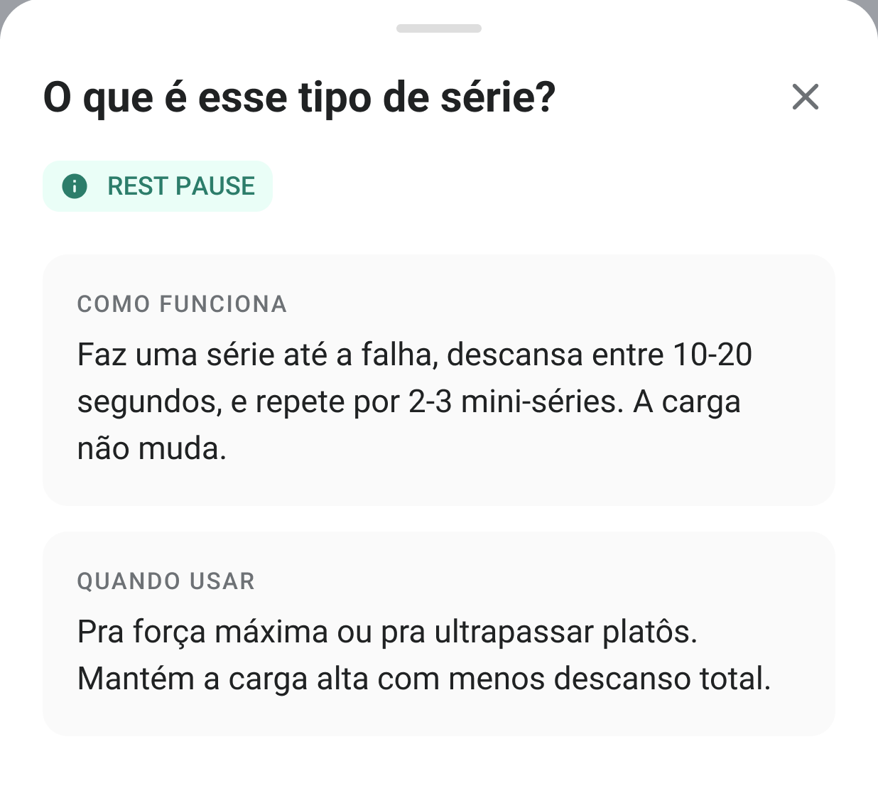
The badge also gained an information affordance. What opens is not a paragraph — it answers two questions in two labelled sections: how it works, and when to use it. Someone who has never done a rest pause needs the first; someone deciding whether to push through a plateau needs the second, and they are rarely the same person on the same day.
Decision 03
Rest shrinks instead of blocking.
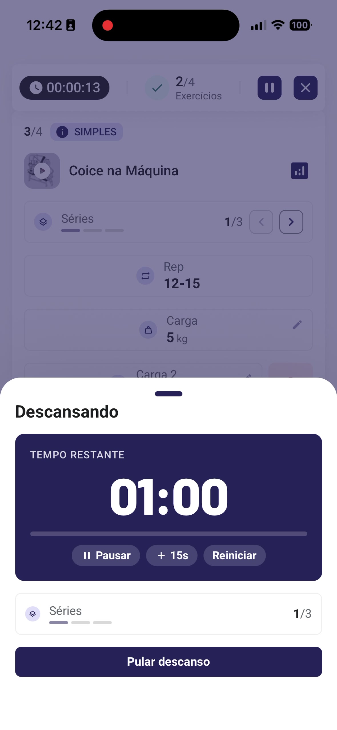
Rest opens as a sheet, with controls to pause, add time or restart.
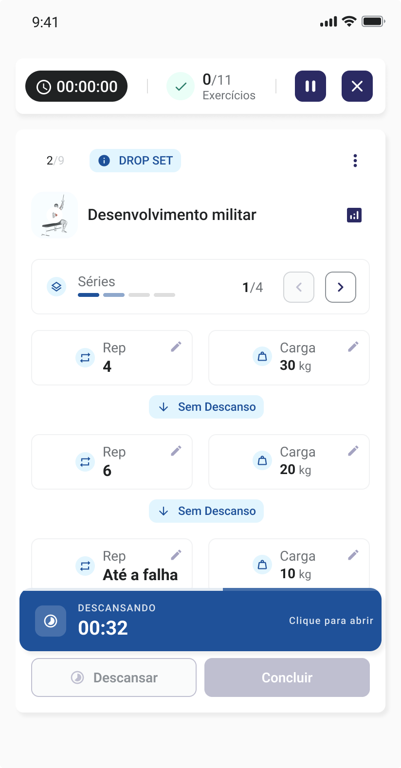
Collapsed into a bar, the whole card stays readable behind it.
The timer stopped being a state the app puts you in and became something running alongside you. You can keep scrolling, adjust a load, or look ahead at the next exercise while it counts down.
How it got made
The bottleneck was never the idea. It was drawing every state.
This problem multiplies badly. Five methods, each with its own number of series, each series with a different transition, plus the resting state, the completed state, the edge cases where a coach configures something unusual. Drawing all of it by hand is weeks of Figma work before anyone can react to a single screen.
I used Claude to generate the variations instead — describing the rules the technical team had given me and getting back the full set of scenarios to react to. Weeks of drawing collapsed into a few days that covered design, testing and validation together.
What changed was not the drawing speed. It was that testing could start while the thinking was still soft, so the states that survived were the ones that survived contact with people, not the ones I happened to draw first.
Results
Coaches stopped being asked how to do the workout.
Reports of athletes asking their coach how to execute an exercise or a method dropped by more than 70%. That was the exact goal: the question was never supposed to reach a person, because the person is not there when the set is being done.
It is the measure that matches the problem. Not time on screen, not taps — whether the screen answered the question that used to be asked out loud, hours later, to someone who could not see what you were looking at.
The number comes from the coaches themselves. These questions arrive by message or in person, where no analytics reach, so the people who were being interrupted are the only ones who can count them. Self-reported, and worth reading as such — but reported by the people who were paying the cost.
Travis Co-pilot
AI chat inside a B2B workflow, shipped in 2023 — before the patterns existed. 145 sessions from 24 analysts in the first month.
Open case +Close case −
Travis Co-pilot
AI chat inside a B2B workflow, shipped in 2023 — before the patterns existed. 145 sessions from 24 analysts in the first month.
Problem
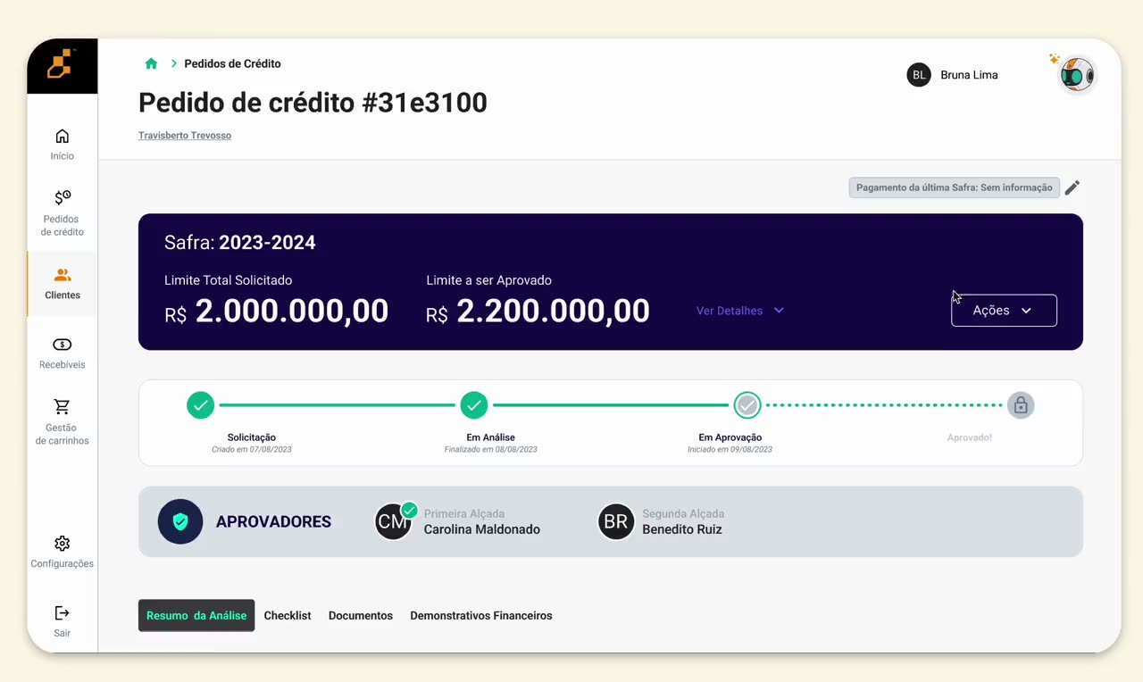
The platform had the risk scores, but analysts couldn't see why — and in 2023 there was no AI-chat pattern to borrow from.
Solution
An LLM co-pilot grounded in a knowledge graph: compact inside the workflow, expandable when the question got deeper.
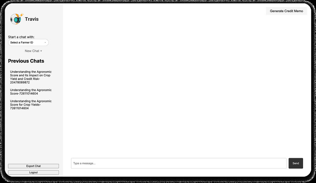
The first POC. Answers were long and hard to scan mid-analysis.
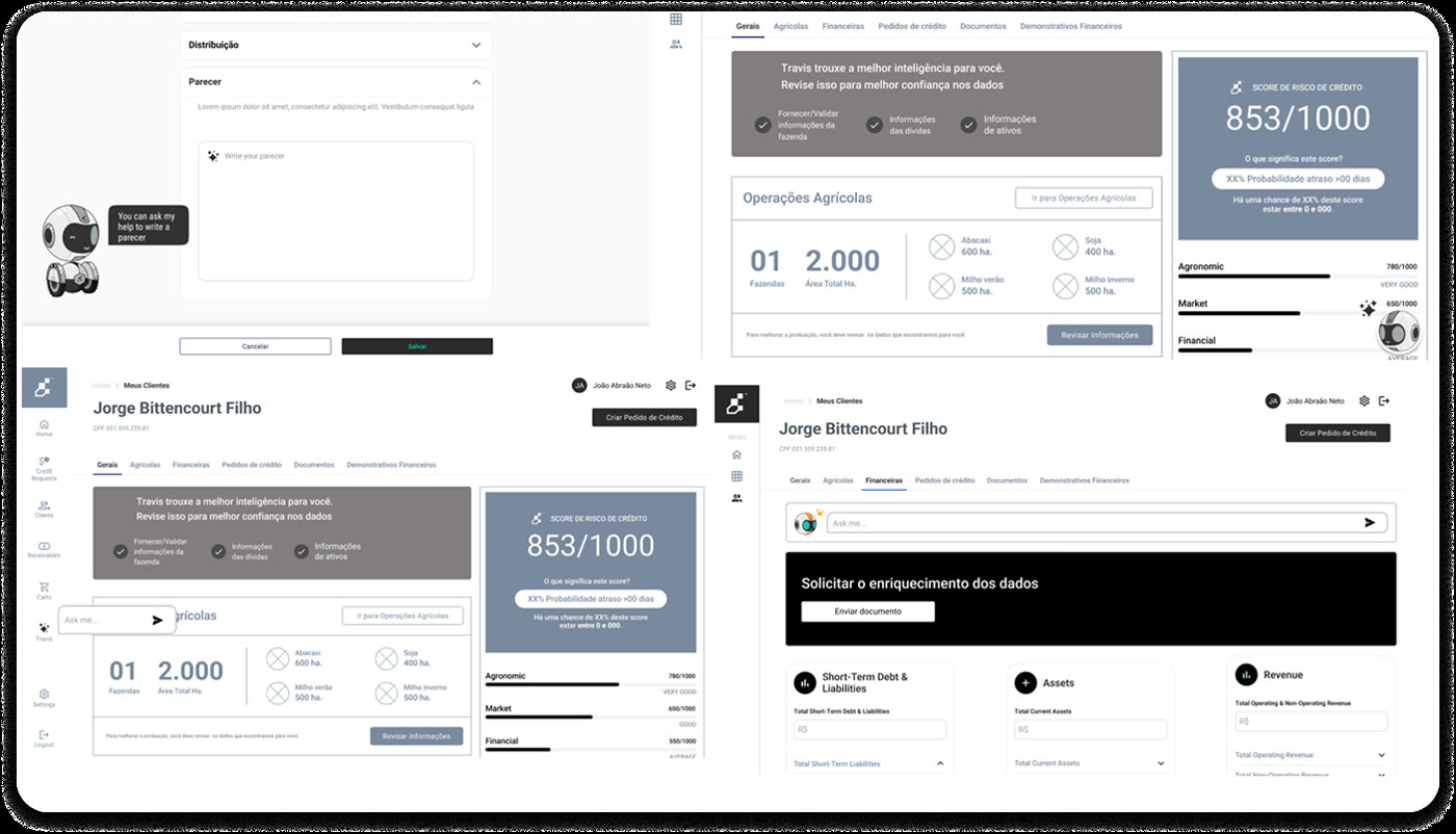
A working session with AI, engineering and product to shape the concept.
Compact beside the analysis, expandable into a full investigation.
Context
An analysis could take days, and had to be defended in a committee.
Agricultural credit analysis pulls dozens of variables together: fragmented documents, legal records, ownership structures, crop data, financial indicators. Analysts need accuracy, because every recommendation is presented to a credit committee and argued for.
The constraint
Shipped in 2023 — the same months as ChatGPT's earliest interface.
There was almost no established pattern for AI-chat UX inside a B2B workflow product. Every interaction model here had to be worked out from close to zero, without a reference to point at.
Discovery
A proof of concept, to test four things before committing.
- Did users see real value in it?
- Was the model behaving as expected?
- Could users understand and trust its answers?
- Which use cases actually mattered?
What we learned
The intelligence was there. The reading cost was the problem.
Analysts saw strong value in investigating lawsuits, property and ownership, crops, productivity over five years, and the relationships between companies, individuals and family members.
But the first experience created new friction: responses were too long to scan, and users spent real effort both forming the question and interpreting the answer. The opportunity was not a more powerful AI — it was making its intelligence usable during a live analysis.
Decision 01
Beside the work, not on top of it.
I ran a cross-functional session with AI, engineering and product. Travis stayed available at the top of the platform for quick questions without leaving the company analysis, and expanded into a full-screen investigation when the question needed depth — without losing the context it came from.
Decision 02
Answer first, evidence next, never a wall of text.
The response structure prioritised the conclusion, the evidence supporting it, the risks worth attention, related entities, and the next question worth asking. Structured output instead of prose — because the analyst is reading against the clock, and has to defend what they read.
Results
Not treated as a novelty: people came back.
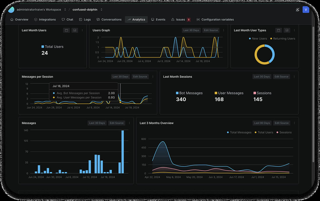
145 sessions from 24 analysts in one month — roughly six each, with returning users making up the majority of activity. Around 1.2 messages per session against 2.3 responses: short, task-shaped exchanges rather than long conversations, which is what a live analysis needs. Activity rose noticeably in the second half of the period, as people found their own use cases.
Afterwards
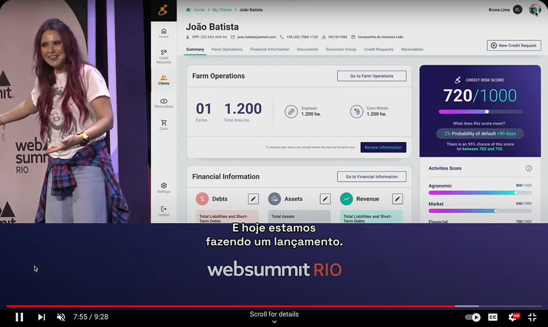
Presented on stage at Web Summit Rio.
I studied social psychology before I studied interfaces. It taught me that trust isn't a visual style — it's a set of decisions about what you show, when, and how much.
I hold a degree in Graphic Design, and have spent six years designing for healthcare, text-to-speech, agricultural credit and institutional finance — mostly inside distributed teams spread across countries and time zones. I am currently studying for a second degree, in Psychology.
Why some interfaces just feel right ↗ — a short read on the psychology quietly deciding whether people trust what's on their screen.

Researcher ↗
For almost two years I worked as a researcher in social psychology, responsible for data analysis and interpretation.
Chapter leader, Ladies that UX ↗
LTUX is a global community promoting women's skills and talent in user experience. I brought a chapter to my city and built a community of women from Paraíba engaged in UX.
Virufy — UX Researcher ↗ International team
I entered UX volunteering on the early stages of a project using AI to detect COVID-19 and other respiratory diseases. Research across Latin America, in English and Portuguese, validating the cough donation flow across countries.
Thinkbox — Product Designer Brazil
Sole designer on the full redesign of an AI speech-to-text platform, including the design system.
Traive Finance — Product Designer International team
More than five projects over two years, leading design on two of the company's most important: Travis, an LLM enhanced with a knowledge graph, and the reseller experience redesign.
iConnections — Product Designer International team
End-to-end design of the mobile feed, from product strategy and research through launch and iteration, plus global navigation and internal tooling.